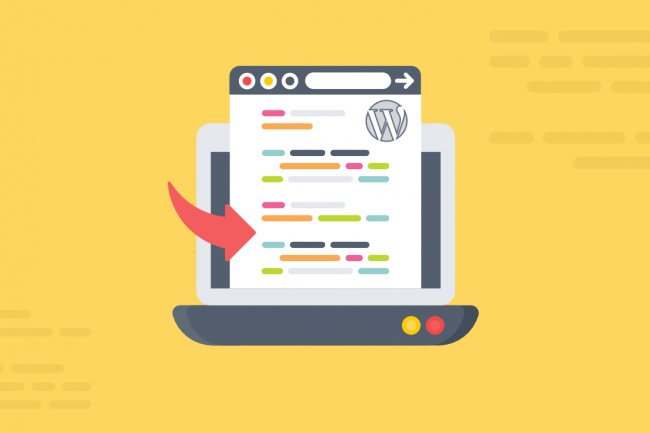
What is responsive typography?
The consumption of content constantly improves when it is easy to comprehend. Comprehension becomes better when the content is equally enlightening on all platforms. This is responsive typography.
People use all devices for conducting web searches. Over the years, due to technological advancements, there has been an increase in the creation and consumption of content. However, the chances of a piece of content doing good on the web depend upon whether or not it is interface friendly. This is to say that web search should be as convenient and approachable on phones as on desktops. The consumption of content constantly improves when it is easy to comprehend. Comprehension becomes better when the content is equally enlightening on all platforms. This is responsive typography. It ensures that the content on the web is visible adequately on all platforms – from mobile phones to laptops to desktops.
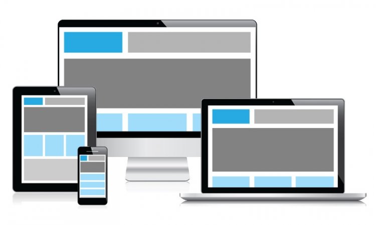
How to ensure a responsive web design?
Accurate typeface
The typeface is the web front. It contains letters and numbers with a variation in size and font to make it compelling. The right typeface increases the comprehension of the content. Additionally, it improves the appearance, engagement, emotion, brand awareness and readability of the information. The most crucial thing while deciding the typeface is setting the link between the kind of content you want to deliver and the outlook you want. The two items must complement each other; otherwise, the content looks haywire with an odd representation.
Typography Scale
A typography scale is used to establish a relationship between readability on the mobile screen and a laptop or desktop. When one is viewing content on their mobile phones, a smaller font will suffice. However, when one is consuming content through their computer, the fund size must be greater. The change is due to the distance between the screen and the user when going through the content on a small screen and a larger screen. The other thing to consider is the scaling ratio, which also affects readability and ranges from 1x to 2x. eCommerce websites have a high scaling ratio, blog websites have a medium scaling ratio, and infographic websites have a low scaling ratio.
Alignment and presentation
The one thing to remember during alignment is to make it similar throughout. This is to say that if the beginning of the text is right-aligned, stick to the same for the rest of the body unless a change is absolutely necessary. For laptops, the margins should be larger, while is phones, they should be smaller. This is so that a sentence of the average length can be accommodated on the mobile screen parallel to the laptop screen. For both laptops and mobile phones, a sentence should have a maximum of 80 characters and a minimum of 35 characters.
Spacing and contrast
There should be adequate spacing between words and sentences. The sentences must end with proper meaningful words and not words like so, like, that, etc.; the contrast of the text is equally important since it directs how appealing the text is. The contrast must not be too weak, like grey, so it makes the text unreadable. The contrast must not be too bright either, so it dissolves the text over it. The contrast must be able to complement the text and blend the sentences to increase engagement. Additionally, the text must be such that it does not need a lot of adjustments. You will require to move your phone screen to access the entire text. However, this will not be the case on your laptop since it is encompassing. However, the need for adjustment must not be too often, or the text becomes monotonous and loses attention.
Create valuable content
The main aim of responsive typography is to improve the impact of content. You cannot expect your content to sell or become popular; it does not impart something valuable. There is a plethora of web pages, articles and ads over the internet. However, not all of them do well. The ones that do have an undeniably appreciable presentation. Additionally, the mass population consumes content that directly caters to their queries and problems fruitfully and conveniently. As much as you can, try keeping the content to the point. The content must be such that the audience can take away something from it, and this is possible when they will engage with the content. Needless to say, engagement improves when the presentation is top-tier, and that is what responsive typography takes care of and betters content over web pages.
What's Your Reaction?


